This covers things like color, tag lines, typography, and all that other stuff that gets to a consistent representation of the Ace Makerspace brand and identity. While the brand expressed below is still undergoing some “finessing” it reflects our current direction.
Standards
- Name: Ace Makerspace.
- Our name should always be written with the first letter of each word capitalized and the rest in lower case (except in our logo). Write “Ace” or “Ace Makerspace” not “ACE.”
- In our logo and brand materials “ACE MAKERSPACE” should be written in all caps.
- When the name of one of our programs or tools follows “Ace” then the first letter should be capitalized because it is a proper noun.
- Character/Tone/Brand Personality: Playful, Approachable, Curious, Open, Welcoming, Community
- Logo attributes: Clean, readable at many scales, easy bw/color executions and physical fabrication
- Tagline: Making is for Everyone
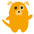
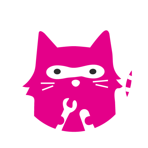
- Mascot attributes: Depicts lots of emotional states, can be fabricated lots of ways
- Color Pallets: Primary 4 colors max (light / dark) | Secondary: 4 colors max

- Primary:
- #FCCC00 yellow
- #64BAE7 light blue
- #96BC55 grass green
- #3636B2 violet
- #E30689 hot pink, PMS: Rhodamine Red
- Secondary:
- #808080 medium gray
- #2D2D2D charcoal (logo)
- #85B725 Darker Grass Green
- #F6A200 Gold
- #8F009B Purple
- #258fEE Dark Blue
- Primary:
- Typefaces: Open Sans (body, mostly), Roboto Slab (headings) – Google fonts
Development of the New Brand
During the winter of 2019/2020, we finally bit the bullet and started to rebrand under Ace Makerspace. The “Ace Monster Toys” name wasn’t helping people find us and was a barrier to fostering a sustainable org. This is a lot of work from a tech and marketing perspective. This is a DBA, not a legal name change.
Coming to the new name was a member-involved process that went on for a few weeks including using a name generator. It may seem like a boring switch but the old name did us no favors. We were constantly being mistaken for a toy factory.
Brand Application
These are goals that supplement our basic standards. These goals apply to emails, web pages, and flyers primarily.
- Pictures with faces whenever possible
- Unique graphics (avoid free and common use icons and free images)
- Rounded corners on photos
- Bold color use, single hero colors
- Short animations to focus on good storytelling
- Bold use of type
- Okay to use a special typeface for a specific campaign or series in a campaign
- Typefaces that can print well and not just look good on screens are ideal
- Minimalist layout with white space and minimalist content composition
Signage Around Ace
Signs inside of Ace should conform to this color standard:
Signs for information for all members and users of the space:
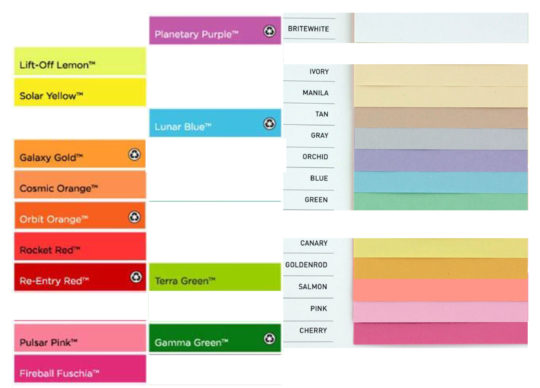
- printed on Astrobrights Fireball Fuchsia (hot pink) paper
- font is Robot Slab, text is black
- if applicable, says “for member use”
examples: storage of items for member use, honor bar, signs indicating which tools require certification
Signs delineating items for organizational usage only and not for member free usage:
- printed on Astrobrights Terra Green (lime green) paper
- font is Robot Slab, text is black
- if applicable, says “org use only”
examples: bins of supplies for classes, honor bar re-stock goods
Signs relevant to safety and emergencies:
- printed on Astrobrights Solar Yellow paper
- text is black
examples: breaker box instructions, do not put things in this area signs
in general these signs are laminated before being put in place. For an area that is well-organized this way, see the textiles area
Appendix
Colored paper available from Copy Central
History
== Official Name ==
As of September 2017, ”’the organization should be referred to as “Ace Monster Toys Makerspace””’ in any externally-facing materials (e.g., outreach documents, meetup events, marketing activities). As “makerspace” becomes a commonly understood term associated with the set of activities that AMT provides, it is in the organization’s best interest to clearly promote its association with the term. To encourage clear branding of the makerspace as such, any flyers and emails should include the term “makerspace”. AMT partners (e.g., Department of Spontaneous Combustion) should be encouraged to use “Ace Monster Toys Makerspace” in any of its publicly-facing materials as well.
== Abbreviation of “AMT” ==
“AMT” can be used as an acceptable abbreviation for Ace Monster Toys Makerspace in:
1) Any internal documents where all potential readers are familar with the organization
2) The body of any public outreach documents after the introduction of the full organization name – Ace Monster Toys Makerspace. Best practice in this regard is to include this abbreviation in parentheses directly after reference to the organization
”example: Ace Monster Toys Makerspace (AMT) will be hosting a “DIY Burning Man emergency kit” workshop on Tuesday, July 27th. This workshop will be lead by AMT veteran Bur Ningman, who also has a perfect attendence record at the Playa for 2 decades running. ”
== Colors ==
Below is the color pallet used for expressing the AMT identity. When at all possibible please use these core colors when creating graphics for that represent AMT. That doesn’t mean don’t add color or photography… please do… just not to the logo. See below.
Dark yellow = 203,124,23 | cb7c17
Bright yellow = 248,148,28 | f8941c
Red = 201,30,36 | c91e24
Dark grey = 129,130,134 | 818286
Light grey = 167, 138,172 | a7a8ac
Black = 0,0,0 | 000000 | 30,30,30,100
== Logo ==
Go here for everything you ever wanted to know about the logo: [http://wiki.acemonstertoys.org/Logo http://wiki.acemonstertoys.org/Logo]
[[File:AMT-Bot-100.jpg|150px|AMT Bot – Jpeg]]
AMT-Bot-100 [[Media:AMT-Bot-100.jpg|JPG ]]| [[Media:AMT-Bot-100.png|PNG]]
[[File:AMT-Logo-Horizontal-100.jpg|200px|AMT-Logo-Horizontal-100.jpg]]
AMT-Logo-Horizontal-100 [[Media:AMT-Logo-Horizontal-100.jpg|JPG]] | [[Media:AMT-Logo-Horizontal-100.png|PNG]]
[[File:AMT-logo-Vertical-100.png|200px|AMT-logo-Vertical-100.png]]
AMT-Logo-Vertical-100 [[Media:AMT-logo-Vertical-100.jpg|JPG ]]| [[Media:AMT-logo-Vertical-100.png|PNG]]
[[File:AMT-Makerspace-Wordmark-100.jpg|400px|AMT-Makerspace-Wordmark-100.jpg]]
AMT-Makerspace-Wordmark-100 [[Media:AMT-Makerspace-Wordmark-100.jpg|JPG ]]| [[Media:AMT-Makerspace-Wordmark-100.png|PNG]]
[[File:AMT-Medallion-100.jpg|200px|AMT-Medallion-100.jpg]]
AMT-Medallion-100 [[Media:AMT-Medallion-100.jpg|JPG ]]| [[Media:AMT-Medallion-100.png|PNG]]
[[File:Grey-Tool-Icons-100.jpg|600px|Grey-Tool-Icons-100.jpg]]
Grey-Tool-Icons-100 [[Media:Grey-Tool-Icons-100.jpg|JPG ]]| [[Media:Grey-Tool-Icons-100.png|PNG]]
All logo assets in PDF Format can be found [[Media:AMT_Logos_2018.pdf|here]]
== Typefaces ==
Museo
Museo is an open source open typeface that can be found through googling. Also available [[Media:Museo_500.zip|on wiki]].
== Taglines ==
Make – Teach – Hack – Create – Build – Learn – Rule the World
== Images ==
=== AMT Website ===
*Full width banner images are 1280 × 350
*Hero images for blog posts 600 x 300 to 400 px
=== Social Media ===
*2:1 Ratio in either 440 x 220 px or 600 x 300 px is the preferred image size for twitter and facebook.
[[Category:Marketing and PR]] [[Category:Brand Standards]] [[Category:Marketing Coordinator]]
